about Von AllanVon Allan's artVon Allan's comic booksabout Von AllanShop page for Von Allan StudioEssays by Von AllanInterview links by Von Allancontact Von AllanLinks to the I Am Still Your Child documentary film featuring Von Allan  rss feeds for vonallan.com
Showing posts with label process. Show all posts

Wolf’s Head Issue 18 Page 1 Process


I thought it would be fun to share some of the ol’ “process” behind a recent page from WOLF’S HEAD. In this case, it’s the first page to issue 18. And hey, 18 issues in for an indy comic book series is not too shabby, folks.

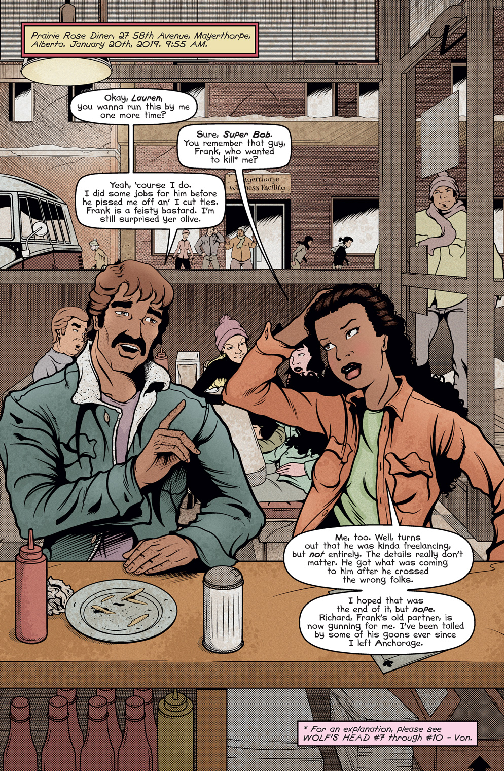
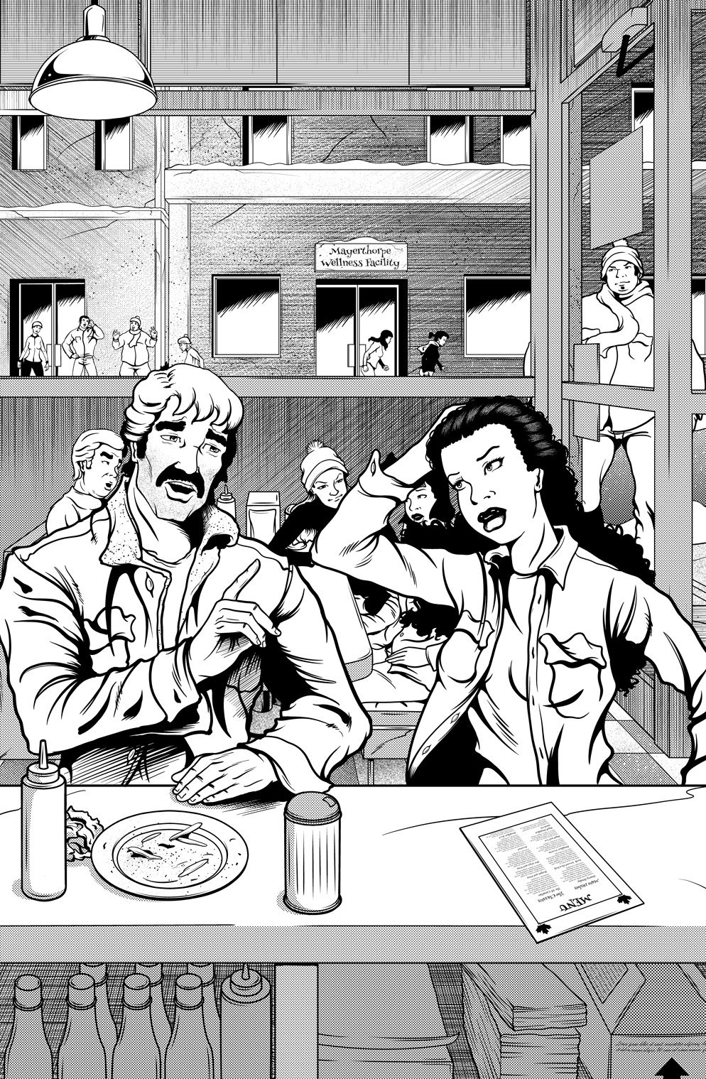
This page features Lauren Greene and Super Bob Sanchez chit-chatting in a diner in Alberta. The page also builds off of issue 17 and the various struggles that Lauren is currently going through. While I don’t think there’s any “right” or “correct” way of starting a comic, I’ve long been partial to opening with a splash page to get things going. This is especially useful here because the preceding panel in the previous issue was actually very small. So if one is reading these issues in sequential order, it should be fun to leave off last ish with a tiny panel and then start this one with a biggie.

I’ll start with the final coloured and lettered page and we can work backwards to the initial layouts. Oh, one important caveat: while some pages take a bit of visual brainstorming, in this case I knew exactly where I was going (building from last issue, right?) so I didn’t need to do that. That’s often not the case and many pages take a bit of thumbnailing (usually tiny thumbnails) to work out mentally how I want to approach a page. This is often especially true for covers; considerations of logos and whatnot influence how the page might look. In other words, sketching and “mucking about with page design” is a tried and true way to go.

WOLF'S HEAD issue 18 Page 1 Final Page illustrated by Von Allan

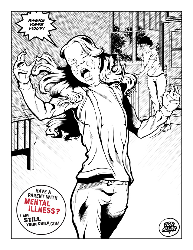
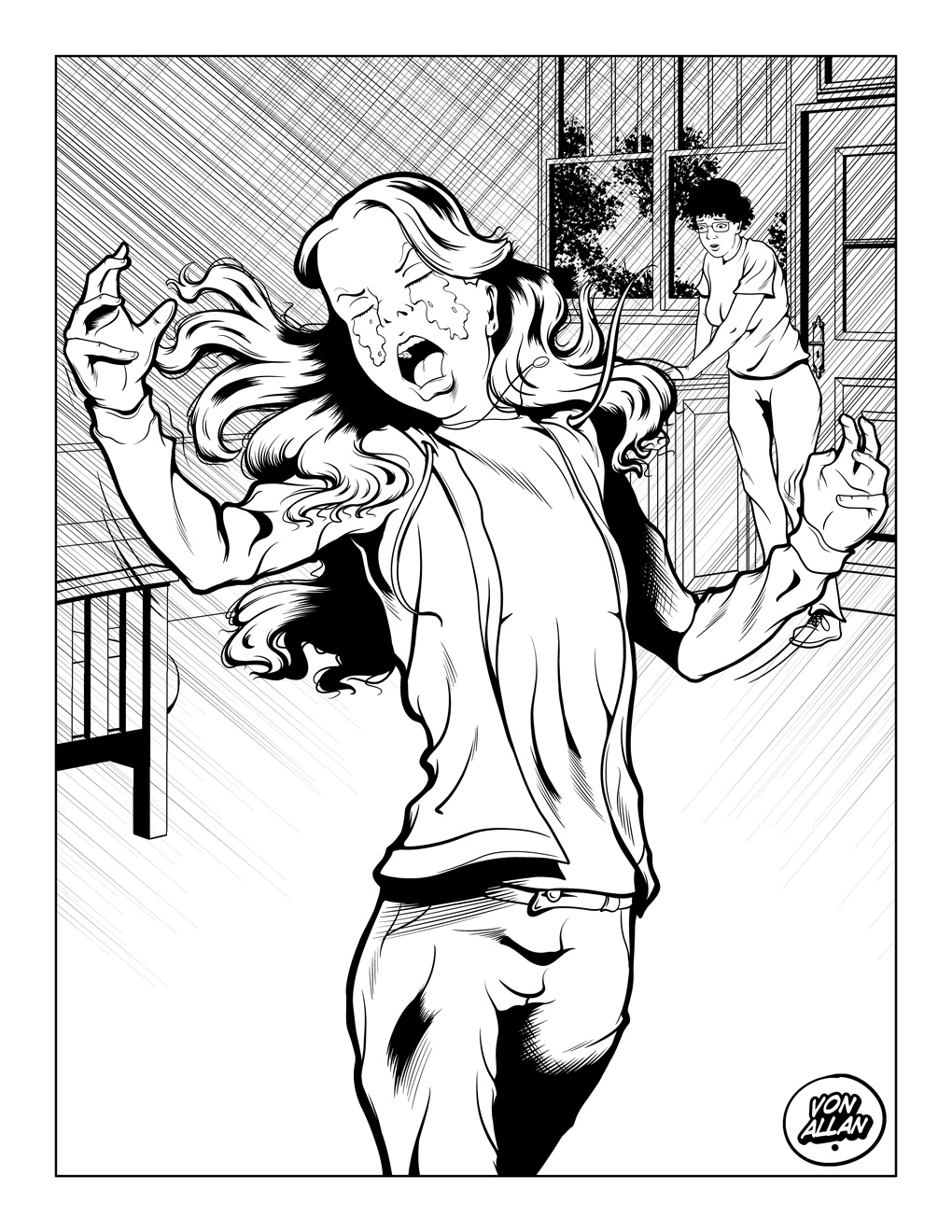
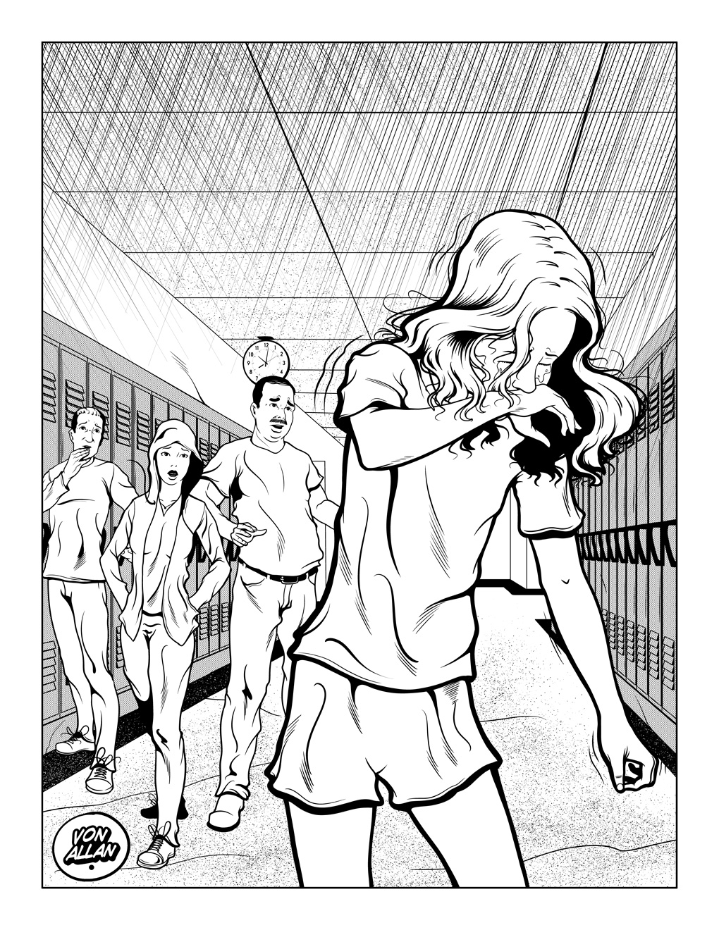
Next are the final inks, including screen tones (or, if you will, Ben Day dots or what I long called “zipatones”). Generally I do not include the lettering in the final inks (well, at least for colour work) and that is reflected here. Inking is one of my favourite things to do and this page was a blast to work on!

WOLF'S HEAD issue 18 Page 1 Final Inks illustrated by Von Allan


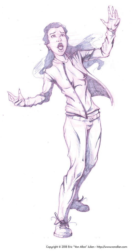
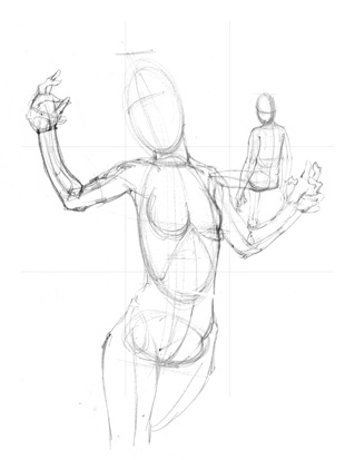
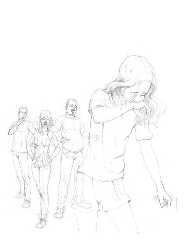
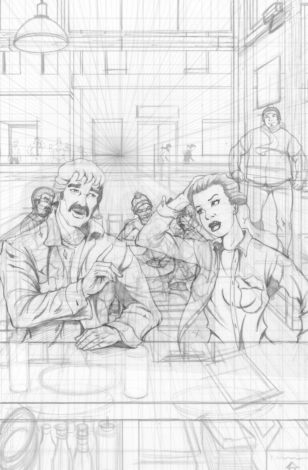
Next up are the final tight pencils. There is a bit of visual cheating going on here. I actually rarely rough out a page like this as one individual unit. Rather, I actually do various pencil sketches (and sometimes even inked sketches) on different sheets of paper, scanning them into my computer and finalizing the pencil layout that way. I like that approach, mainly because it allows me to isolate various parts of the illustration and work on that. In this case, the diner is a good example: isolating the perspective drawing from the figure drawing allowed me to play around with some ideas, something a bit harder to do if everything was on one sheet of Bristol board.

WOLF'S HEAD issue 18 Page 1 Tight Pencils illustrated by Von Allan


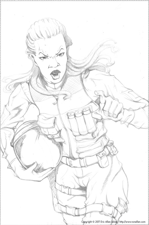
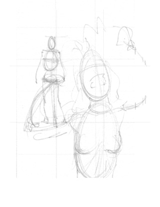
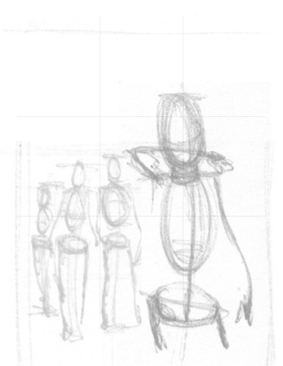
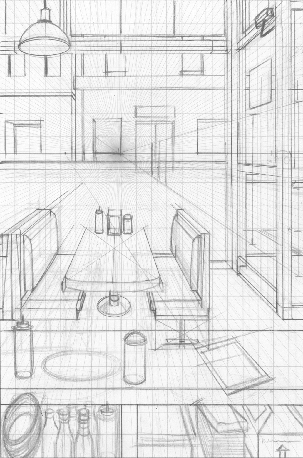
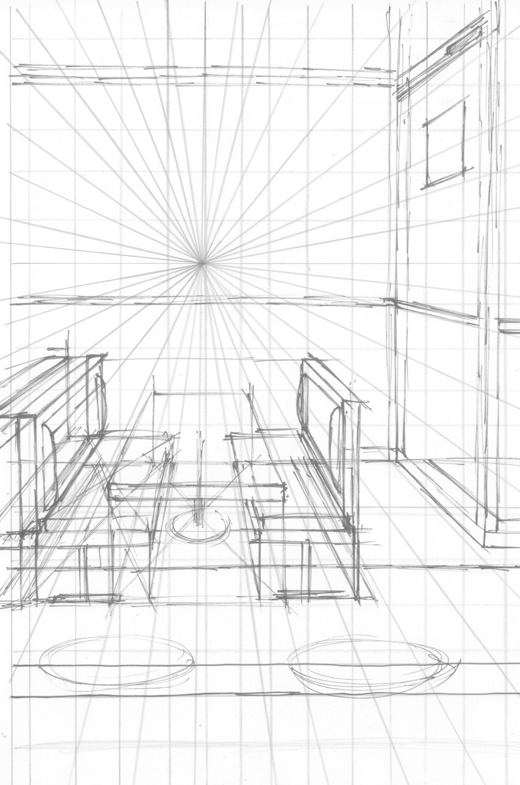
The next two illustrations showcase more of what I mean. First is the tighter pencilled perspective sketch of the diner and that’s followed by the very loose sketch (this time with my trusty Tombow brush pen) as I loosely laid down some ideas. These actually follow part of the same process I described here, but in this case I did do a round of tighter pencils rather than just go into final inks because I needed to be sure of a few different things. The trade-off is time, but I felt it was worth it in this case.

WOLF'S HEAD issue 18 Page 1 Tight Background Pencils illustrated by Von Allan


WOLF'S HEAD issue 18 Page 1 Loose Background Pencils illustrated by Von Allan


Not included here are the separate figure sketches. I generally do loose little gestures, often in ink, and then scan, check, print out, and tighten into final pencils. You can see the final result in that first sketch above.

Some pages are slow, some go surprisingly quick, and this one was somewhere in the middle. It was a lot of fun to do and hopefully starts off issue 18 in an engaging, intriguing, and beautiful way.

Pencils for a pivotal scene in Wolf's Head


Busy working away so here are some loose rough pencils from a pivotal scene in WOLF'S HEAD. One of the things I like about working this way is that I can tweak things a bit once I scan the pencils in. In this illo of Lauren, I made her left hand a bit too big so I digitally shrunk it down. I made some other tweaks, too, but I've already started to lose track of what I did! Ack!

Wolf's Head pencils of Lauren by Von Allan

Wolf's Head Process


One of the things I love about Manga Studio EX4 is the ability to preview layouts. Below are the final inks for the third issue of WOLF'S HEAD. It's kind of a neat "peek behind the curtain" of what's to come.

Wolf's Head Issue 3 Layouts in Manga Studio EX4 by Von Allan

Wolf's Head first issue pencil roughs for page one


I'm currently working away on my new comic, WOLF'S HEAD, that's going to be launching soon. While I can't say too much about it yet*, I do want to start sharing some things. So, rough pencils! Yes! Sometimes I pencil fairly loosely and sometimes I'm somewhat tighter. This is an example of the latter. Since I ink so much of my own work, I generally pencil just enough for me to ink it. It's mainly a time issue; drawing can be slow and perfect pencils are that much slower. I rarely pencil in the way "pure" comic book pencillers do, but then...it's art. Whatever gets you to the end is just fine.

* By the by, I'm not being secretive deliberately. It's mainly because a few things are still up in the air right now that need to be worked out. Rest assured, when I know more I'll be posting it!

Rough pencil sketch for Wolf's Head Issue 1 by Von Allan

I AM STILL YOUR CHILD Upset Girl Poster Process


As noted yesterday, I was commissioned to create a series of posters for the documentary film "I AM STILL YOUR CHILD." Today I'm looking at the development of another poster for the film and the support website. This one is a good example of how the process develops from rough concept to final version.

My initial thinking was that I wanted contrast between a very upset girl in the foreground and an adult, possibly in trouble, who isn't even paying attention. Initially I thought she'd be starring at the girl, but not really seeing her. Later, I changed my mind and had the adult sitting with her back turned. As the process continued and I received feedback from Stéphanie Couillard, my main contact for the poster series for Catbird Productions, the poster evolved. You can see that in the following sketches and I think the piece is much stronger based on Stéphanie's comment. 

Again, here is the Final Press Version with that great logo designed by Sara Morley of Design Postimage:

Final poster version of Upset Girl for the documentary I AM STILL YOUR CHILD

Initial Rough Layout sketch (as always, this is done very small, approximately 2 inches in height):
Initial rough layout sketch for Upset Girl poster from I AM STILL YOUR CHILD by Von Allan

Slightly tighter but still very loose figures. And again, illustrated pretty small. You can also see that the foreground character is slightly off-balance here. It happens, but it's the kind of thing I correct as I go:
Second rough layout sketch for Upset Girl poster from I AM STILL YOUR CHILD by Von Allan

Tighter pencils:
Somewhat tighter pencils for Upset Girl poster from I AM STILL YOUR CHILD by Von Allan

Tighter pencils with that original concept of a "neutral" adult in the background:
Still tighter pencils for Upset Girl poster from I AM STILL YOUR CHILD by Von Allan

This is where a number of things changed. A very different adult figure appears. She was roughed out and tightened separately and then digitally added into the piece. And the background finally shows up, too. Little bit of cheating here, but you can't tell. I hope!

Final pencils for Upset Girl poster from I AM STILL YOUR CHILD by Von Allan

And the final inked version:Inked final illustration for Upset Girl poster from I AM STILL YOUR CHILD by Von Allan

You can see the entire poster series at the film's official website. And the entire film can be streamed online at the CBC's website at http://watch.cbc.ca/absolutely-canadian/-/i-am-still-your-child/38e815a-00cec9fd824

I AM STILL YOUR CHILD Poster Process for Girl In School


I was commissioned to create a series of posters for the documentary film project (titled “I AM STILL YOUR CHILD”) that I've been involved in. The goal was to create a series of stand-alone pieces that feature characters dealing with parental mental illness. Unlike traditional comics, these wouldn't have a narrative save for that unifying theme. And they would also need to be very bold and graphic to catch the eye and presented in black and white to ease desktop printing. I'm pretty pleased with how they turned out. The full poster series can be found at the documentary's official website.

Beginning today, I'm going to go through the creation of a few of these posters. I was given a great deal of creative room by the production crew; they encouraged me to draw on my own thoughts and feelings, especially relevant given my own background with my mom's schizophrenia (developed more full in my graphic novel “the road to god knows...”). Some of these images were inspired directly from my own experiences while others were “pushed.” In other words, still drawn from my own life but dramatized to some extent.

The one below is a good example; I was very shy at school, especially at this age, but showing emotion was something I tried very hard not to do (though how successful I was in a different question). This girl, on the other hand, is very upset. That was something I tried very hard not to show at school.

What follows, then, is a pretty good breakdown of how this poster came together.

First, this is the Final Press Version with a terrific logo designed by Sara Morley of Design Postimage:

Final poster version of Girl in School for the documentary I AM STILL YOUR CHILD

Initial Rough Layout sketch (very small, approximately 2 inches in height):
Initial rough layout sketch for poster from I AM STILL YOUR CHILD by Von Allan

Tighter pencils (figures only; this is slightly deceptive since I drew each character separately and then digitally composed the image to finalize their positions):
Initial rough layout sketch for Girl In School poster from I AM STILL YOUR CHILD by Von Allan

Tighter pencils with loose backgrounds and perspective grid:
Tighter pencils with loose backgroundsfor Girl In School poster from I AM STILL YOUR CHILD by Von Allan

Final inked version with completed background:
Inked final illustration for Girl In School poster from I AM STILL YOUR CHILD by Von Allan
I should add here that sometimes I do pretty tight background renderings and other times, like here, I keep it pretty loose and finalize in ink (albeit digital ink since I use Manga Studio EX 4 for inking). Manga Studio also allows for some really nice shortcuts for tones, hatching, "zipatones," and splatters. I've done them manually (the ol' toothbrush and ink immediately comes to mind for splatters) but I much prefer doing them digitally now.

And that's that. Again, you can see the entire poster series at the film's official website. And don't forget that the entire film can be streamed online at the CBC's website at http://watch.cbc.ca/absolutely-canadian/-/i-am-still-your-child/38e815a-00cec9fd824

Character sketches in pencil


Pencil sketches of Lauren, Patty, and their boy by Von Allan
Head turnarounds in pencil of Lauren from WOLF'S HEAD by Von Allan


These are pretty loose pencils, but I since I ink my own work I generally find loose pencils are a much better and quicker way for me to approach my art. My pencils kind of evolve as I ink anyway; it's not unusual for me to ink for a bit, then switch back to pencils to tighten or correct something, then move right back into inking. I can also do a bit of a weird fusion; while I tend to pencil "traditionally" (i.e.: with an actual pencil on actual paper), I usually do some digital pencilling, too. Partially that's because I often "flip" my pencils so that I can see them in reverse, which is easy enough to when working digitally as I do. And partially because corrections are much faster with digital pencils, at least in my experience.

Whatever gets you to the final image, eh?

Wolf's Head by Von Allan

Link to Von Allan's Wolf's Head comic book series

Email Subscription

If you'd like to receive email updates from Von Allan Studio, please subscribe using the form below.
* indicates required field

Please note: You can unsubscribe from email updates at any time.

City of Ottawa Grant Support

Von Allan Studio gratefully acknowledges the financial support of the City of Ottawa.

City of Ottawa logo

Creative Commons License

I Am Still Your Child Trailer

Documentary Film Excerpt