about Von AllanVon Allan's artVon Allan's comic booksabout Von AllanShop page for Von Allan StudioEssays by Von AllanInterview links by Von Allancontact Von AllanLinks to the I Am Still Your Child documentary film featuring Von Allan  rss feeds for vonallan.com
Showing posts with label comics. Show all posts

Vanier Artisans Christmas Craft Sale


Update! The 2024 poster and event information is at https://www.vonallan.com/2024/10/2024-vanier-artisans-christmas-craft.html

I'm very pleased to announce that I'll be one of the participating artists in this year's Vanier Artisans Christmas Craft Sale. This is organized by the always capable and wonderful Charlotte Taylor and she's bringing together a wide range of artists of different disciplines for the sale. I really like that; I don't like "silos" and the idea that artists have to "stay in their lane" or somesuch has never made much sense to me. I like that different artists can get together for an event like this. That's a neat way to share art and a great way to have some fun. And a special bonus is that I designed and illustrated this year's poster, too!

The poster has all the details. And there's also a Facebook event page for it at https://www.facebook.com/events/1277240033075854/

I'll be bringing a number of my comics and graphic novels, including the hardcovers of WOLF'S HEAD and LOVE, LAUGHTER, AND LOSS. Plus prints, cards, and a few other odds and ends. And I think a very special guest will be joining me there, too. That's all hush-hush and super secret! The only way to find out is to come!

So if you're interested in meeting some amazing artists and perhaps buy some lovely art for Christmas, Hanukkah, Kwanzaa, or "just because," please drop by on Saturday. It should be a lot of fun!

Poster designed by artist Von Allan for the 2022 Vanier Artisans Christmas Craft Sale

Other Links

LUCK! 2022 Fundraiser for the Ottawa Arts Council


I'm very pleased to announce that I'm one of the participating artists in this year's LUCK! fundraiser put together by the Ottawa Art Council. I've been eager to be involved with LUCK! in the past, but the pandemic — being what it is — made these type of events very tricky over the past few years.

My contribution is a limited print. It's titled Memories of the Road and is mixed media on 100% cotton watercolour paper and measures 11" × 17". Signed my yours truly.

A special limited print of Von Allan's 2022 LUCK! contribution for the Ottawa Arts Council

Oh, when I say "limited," exactly what do I mean? Well, this is a special 1/1 (or one of a kind) print for the Council. I may make another version more available in the future, but for now this is it. And for the observant of you out there, this print also has a small tie-in to WOLF'S HEAD. Can you guess what it is?!

Here's how the Ottawa Art Council describes LUCK!:

LUCK! is the Council's annual art draw and fundraiser that offers a diverse showcase of local artists and producers while supporting new projects in our arts community. Invited artists donate an artwork or art experience and guests purchase a ticket to win a creation. This evening is unlike any other in Ottawa, as every ticket is a winner!

This year's LUCK! will be held at Parlour, a really neat restaurant and event space. It's pretty much perfect for LUCK! and I think will give the whole event a pretty special vibe.

I'm really hoping that this turns out to be a wonderful event for the Council and I'm very honoured to be asked to contribute.

Teaser image for the Ottawa Art Council's 2022 LUCK! fundraising event

Other Links

City of Ottawa Grant Support Round 2


Cover of the City of Ottawa 2022 Grant Funding ReportA couple of years ago, I was lucky enough (and surprised enough!) to receive a $4,000.00 grant from the City of Ottawa’s Arts Funding Program. Well, lo and behold, I was again lucky enough to receive a second one from the City of Ottawa’s Arts Funding Program (the PDF announcement from the City is here). Both grants are in support of my ongoing comics project WOLF’S HEAD.

This grant along with the previous one are both incredibly important; they really do give some much needed financial support for my comics endeavours. As I’ve noted, being an artist is not an easy path and every little bit of financial support helps. As I noted when I received the first grant back in 2020, "When a jury of my peers determined that my application was worthy of financial support, my jaw dropped. And it’s taken a bit of time for me to really get my head around it. I’m both honoured and pleased as punch to receive it." The same is doubly true now!

So yes, Von Allan Studio (that’s me, folks!) gratefully acknowledges the financial support of the City of Ottawa!
So what is WOLF’S HEAD about? Well, the best way to explain it is to share the synopsis. Here goes:

Lauren Greene is a young woman who has quit her job as a police officer in Metro Detroit after becoming frustrated with growing police violence. At the same time, and unbeknownst to Lauren, a secretive corporation has created an artificial intelligence (AI) designed for war. An AI that might actually change the world…but not for the better.

Struggling to find work in a tough economy and unsure of what to do with her life, Lauren suddenly has a new problem: her mom, Patty, has found and connected with the newly born AI. And, partially due to that connection, the AI has become empathic and humane, much to the frustration of the corporate executives and scientists who created it. After Patty helps the young AI escape under the cover of a huge research factory fire, she turns to her daughter for help keeping it safe.

Giddy with excitement, Patty doesn't recognize the danger she has put herself in…but Lauren does and she is terrified. Her fear is realized when the two women are confronted by corporate forces who want to stifle knowledge of the AI and keep it for themselves. As Lauren does her best to keep her mom safe, the tensions over the AI erupt between them, leaving Lauren on her own.

Broke, down on her luck, and needing a job very badly, Lauren turns to her friends for help, all the while keeping her mom's discovery a secret.

Last thing: There is a dedicated website for the series at https://wolfs-head.vonallan.com/ with a great deal of extra content. Working on the series has been an incredibly rewarding experience. And the reviews have been very strong (for example, Frank Plowright did a lovely one and Professor David Beard did a fantastic one.

City of Ottawa logo

Other Links

Thoughts on Wolf's Head Book 1


Teaser image for Wolf's Head Book 1
Teaser image featuring a montage of the first six issues of Wolf's Head
As WOLF’S HEAD BOOK ONE continues to make it’s way around the world, I thought I’d take a moment and talk about what’s inside the book. At 176 pages, it’s packed full, featuring the first six issues of the digital series as well as loads of “extras” that serve as a peek behind the curtain of its creation.

Right from the beginning I tried very hard to design the series to work episodically as well as collectively. What does this mean? Well, each issue stands on its own, giving what I hope is a terrific reading experience. Probably the only exception to that is the very first issue. Why? ‘Cuz issue 1 ends on a cliffhanger! Issues 2 through 6 don’t, however, and I really wanted that to be an important of the series. This is the notion of “episodic closure” that I’ve discussed before. At the same time, I also wanted an impetus, that sense that events were building towards something. Step by step, issue by issue, events and circumstances were racing towards a strong climax. That culmination is in issue 6 and I think that payoff is incredibly exciting; when the six issues are read together, one gets a really neat story. A story full of change, reversals, and excitement! The hardcover collects all of that in one handy place. Plus its a beautiful edition, too!

That’s something I love about comics. I also love it about storytelling in general, but I especially love it in comics. That sense of “Wait! What happens next?!” WOLF’S HEAD has that in spades and I’m extremely pleased with how everything turned out.

Of course, you don’t have to own the hardcover to get that thrill. The digital series does the exact same thing, just in a slightly different format. While I think the hardcover is great for curling up and reading, reading on a tablet or even your phone can offer the same kind of experience. When it comes to my own reading habits, I’m not an elitist. I read paper books, I read on a tablet, and I read on my phone. And I read all sorts of stuff, including comics on all of these platforms. For digital, I tend to prefer reading on a tablet, but I’ve had lovely experiences reading on my phone, too. For the digital series of WOLF’S HEAD, I worked very hard to ensure that even for those reading on their phone the experience would still be really smooth and intuitive.

So, what’s next? Well, I’m hard at work on issue 18 and that should be out in the not-too-distant future. And I’d also like to collect the second story arc into a matching hardcover, too. There’s no firm date for that yet, but it’s coming.

In the meantime, please enjoy WOLF’S HEAD in whatever form suits you best. The whole idea was to offer readers a lot of different ways to enjoy the series. If it’s the hardcover, terrific! It’s the digital versions, great! Whichever way suits you best works just fine for me!

Oh, and if you’re brand new to the series and would like to learn a bit more, here’s the ol’ Elevator Pitch for BOOK ONE: “Lauren Greene is an ex-police officer who turned her badge in after becoming frustrated with the police force’s corruption. She’s had enough of violence and is thinking about packing her bags and hitting the road to see how she can make a difference out in the larger world, when her mother Patty shows up at her door with a complication. It turns out that Patty’s employer — a secretive military corporation — has created an artificial intelligence to fight humanity’s wars. Unfortunately for the corporation, the AI fell in love with Patty’s humanity and orchestrated its own escape through her. Giddy with excitement, Patty brings the AI straight to Lauren for help, not realizing the danger she’s putting herself and her daughter in. But Lauren has dealt with people like this; she knows what they’re capable of and she is terrified. Her fears are realized when she and her mother are confronted by corporate goons who want the AI for themselves and are willing to do anything to get it. As Lauren does her best to keep herself, her mom, and her family safe, the tensions over the AI erupt into violence… and suddenly Lauren is on her own. The new little life form doesn’t want to go back to the corporation and Lauren realizes it cannot be forced to live out its life as a war machine. There is already enough corruption, inequality, and violence in the world; the AI has to have a chance to help humanity — peacefully — while figuring out its own existence. Together with the AI, an eccentric cast of friends and family, and her dog, Lauren must figure out her next steps… while keeping herself alive.”


Where To Buy

Here are all of the key purchasing links for the hardcover:

United States of America


Canada


United Kingdom


Mexico


Spain


France


Germany


The Digital Series

Promo of Lauren from Wolf's Head announcing the series debut on Kindle
Don’t forget that the series page for the digital version of WOLF’S HEAD on Kindle can be found using the following links:

WOLF'S HEAD BOOK 1 in hardcover worldwide!


Hot on the heels of the release of my first hardcover (LOVE, LAUGHTER, AND LOSS: A COMICS COLLECTION) comes the biggest release of my career so far! WOLF'S HEAD BOOK 1: WE ALL WANT TO CHANGE THE WORLD.


Cover of Wolf's Head Book 1: We All Want To Change The World by Canadian comics writer and artist Von Allan

That’s right! I’m very pleased to announce that WOLF’S HEAD BOOK 1: WE ALL WANT TO CHANGE THE WORLD has now been published in a deluxe hardcover edition! This book (and whew, it is gorgeous!) collects the first six digital issues of my ongoing comic book series WOLF’S HEAD and packed with extra material. Altogether it’s 176 pages in length and I’m proud of it. Damn proud, in fact.


In many ways, LOVE, LAUGHTER, AND LOSS was the test case for WOLF’S HEAD. When I published that short story collection, I noted that it was the first time that my work had ever appeared in a premium hardcover format and I was pretty nervous about it. Part of the reason to do that collection in hardcover was a test case for WOLF’S HEAD. I wanted to make sure that WOLF’S HEAD looked as good as possible and the only way to know for sure was to test. And then test again. Which is exactly what I’ve been doing over the past year or so while production continued on the ongoing WOLF’S HEAD comic.


Now, some of you may ask about the previously published print editions of WOLF’S HEAD. Those came out in seven “issues” over the past few years. Each print “issue” collected two of the digital issues together, creating a print edition that was approximately 60 pages in length. These were in trade format (which means that they have a spine rather than being saddle-stitched — stapled — like a “typical” 32-page comic book). I was never very happy with these print versions. Why? Well, the first reason is that it was a compromise for publishing into the Direct Market (this is explained fully here). The second reason was that both the format and the print quality weren’t quite what I was hoping for. Does that mean they were awful? No, far from it, but to keep costs down the paper wasn’t the best. I never found the printed colours in these trade paperbacks looked quite right. Worse, being printed in trade paperback format meant that you could never lay the comic out flat, like you can with a “typical” 32-page comic. This new hardcover corrects all of that; the newly remastered colours (more details on that here) combined with better paper means that everything looks beautiful, the hardcover is actually quite a bit larger than the previous trade paperbacks so that the art really “sings”, and it’s much easier to lay out the book flat if you’d like (though keep in mind that at 176 pages this will not sit flat like a 32-page comic would).


Going forward, the trade paperbacks have been discontinued and will no longer be supported in print. In other words, when they sell out, that’s it! They won’t be reprinted. The series will continue in digital format and, when a specific number of issues have been completed, these will be collected into hardcovers, too. In other words, hardcover is the way the series will be printed, at least for the foreseeable future. I also believe that collecting issues into “story arcs” is the best way to present my work. I hope that you will think so, too.


I'm also pretty confident now that WOLF'S HEAD will also be debuting as a webcomic in the not-too-distant future. That would give folks a third way to read the series. I don’t want to say much more about that yet, though!


Additional Photos!


Wolf's Head Book 1: We All Want To Change The World by Canadian comics writer and artist Von Allan cover montage


Wolf's Head Book 1: We All Want To Change The World by Canadian comics writer and artist Von Allan cover


Wolf's Head Book 1: We All Want To Change The World by Canadian comics writer and artist Von Allan interior page


Wolf's Head Book 1: We All Want To Change The World by Canadian comics writer and artist Von Allan interior page


Wolf's Head Book 1: We All Want To Change The World by Canadian comics writer and artist Von Allan interior page


Wolf's Head Book 1: We All Want To Change The World by Canadian comics writer and artist Von Allan interior page


Wolf's Head Book 1: We All Want To Change The World by Canadian comics writer and artist Von Allan interior page


Wolf's Head Book 1: We All Want To Change The World by Canadian comics writer and artist Von Allan interior page


Wolf's Head Book 1: We All Want To Change The World by Canadian comics writer and artist Von Allan interior page


Wolf's Head Book 1: We All Want To Change The World by Canadian comics writer and artist Von Allan interior page


Links to Purchase


WOLF’S HEAD BOOK 1: WE ALL WANT TO CHANGE THE WORLD is still “propagating” out there (in fact, I'm still waiting to get my own copies for local distribution), but here are some initial purchasing links that I know of for sure. More will be added as they appear.


WOLF’S HEAD is truly a journey of love for me. It represents the best art and writing I’ve ever done and I can’t wait for people to hold the hardcover in their hands!

Love, Laughter, and Loss—A Comics Collection now available in Hardcover


This has been a long-time coming, but I’m very pleased to announce the publication of my latest comics collection! And, for the first time, this is a premium hardcover! Titled LOVE, LAUGHTER, AND LOSS: A COMICS COLLECTION, this edition features nine short stories in full colour. The printing and colour fidelity are top-notch; in fact, I don’t think my work has ever looked this beautiful.


Cover of Love, Laughter, and Loss: A Comics Collection by Canadian comics writer and artist Von Allan

These stories have appeared in print before, mainly in two separate periodical collections that are now out of print. The first periodical was titled WIZARDS FOR HIRE — CHEAP! while the second periodical was titled STORIES! 2015 TO 2019. While I was very happy to see these two editions published, keeping saddle-stitched editions in print was, frankly, a pain. Publishing LOVE, LAUGHTER, AND LOSS is a much better way of keeping them in print. On top of it, many of these stories were recoloured for this new hardcover. And that means a number of these stories have never looked this good before. Am I happy with it? Oh yes!

All of these stories have also been released on this very website in webcomic form. In other words, there’s no need at all to guess on what’s included in the collection. All of these stories can be found at https://www.vonallan.com/p/comics.html — and you can navigate from there to find each individual story. The stories included in this hardcover collection are as follows (with links to make direct navigation even easier):
I just want to reiterate how pleased I am with this edition. I was actually pretty nervous about it; I’ve never printed a hardcover before and there were a few logistical issues that I ran into that slowed production as I took my time ensuring the best quality control possible. I was holding my breath when the physical proof copy arrived and I was pretty nervous when I “unboxed” it. My fears were misplaced; everything turned out beautifully.

If you love comics, especially independent/small press comics, I think you’ll fall in love with this edition. I know I have — and that’s saying something!

Links to Purchase


LOVE, LAUGHTER, AND LOSS: A COMICS COLLECTION is still “propagating” out there, but here are some initial purchasing links that I know of for sure. More will be added as they appear.

Photos of the Graphic Novel!

Love, Laughter, and Loss cover by Von Allan

Love, Laughter, and Loss cover by Von Allan

Love, Laughter, and Loss cover by Von Allan

Love, Laughter, and Loss cover by Von Allan

Love, Laughter, and Loss cover by Von Allan

Les lâches clercs de Rigel V


Ce qui suit est une expérience. Je suis un écrivain et un artiste de langue anglaise, ce qui m'irrite au plus haut point, d'autant plus que beaucoup de membres de ma famille sont originaires de la province canadienne du Québec et parlent couramment le français et l'anglais. Malheureusement, je suis unilingue anglais. Ce qui suit est une tentative de traduction d'une de mes bandes dessinées en français. Comme je ne parle pas français, j'ai dû utiliser des outils en ligne pour m'aider (principalement deepl.com et bonpatron.com). J'espère que la traduction est satisfaisante, mais n'hésitez pas à me faire savoir si je me suis trompé.


Maintenant que tout cela est réglé, c'est parti !

Les lâches clercs de Rigel V - Une bande dessinée écrite et illustrée par Von Allan

Learning By Failing - Colour Theory and Comics


I made a mistake.


Definitely. A mistake. And it wasn’t just a small mistake, either. It was a pretty big mistake and one that took some doing to correct. Mistakes are like that sometimes. While one can learn and grow from making them, it can still be a frustrating and discouraging process to fix them.


See? That’s easy enough to write, but it’s surprisingly hard to explain. Harder still is the fact that I’ve actually made a lot of mistakes. Not the kinds of mistakes that hurt anyone (well, except perhaps myself), but certainly the kinds of mistakes that can be hard to recover from.


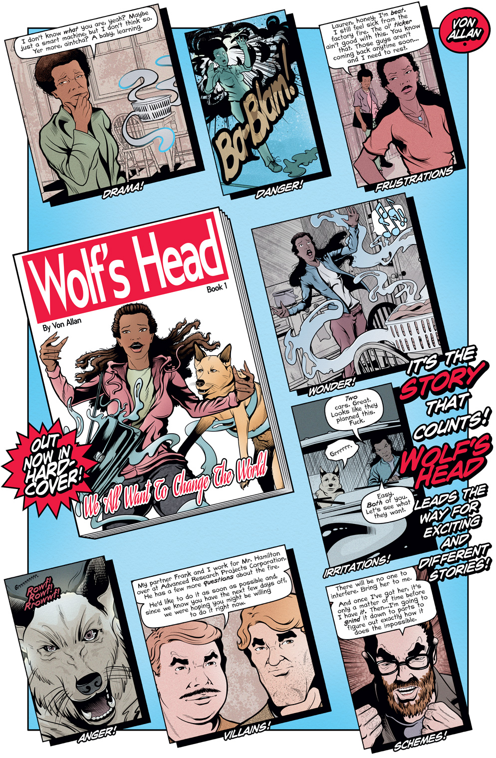
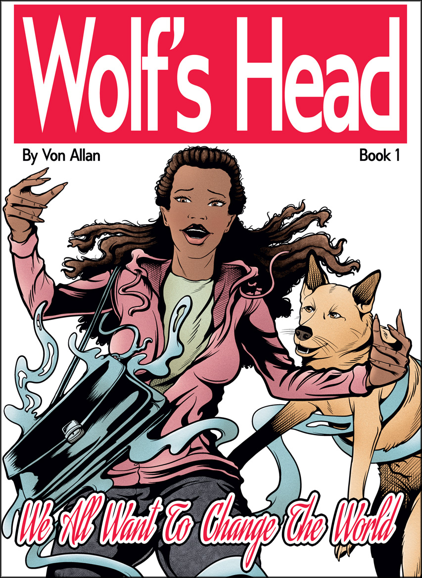
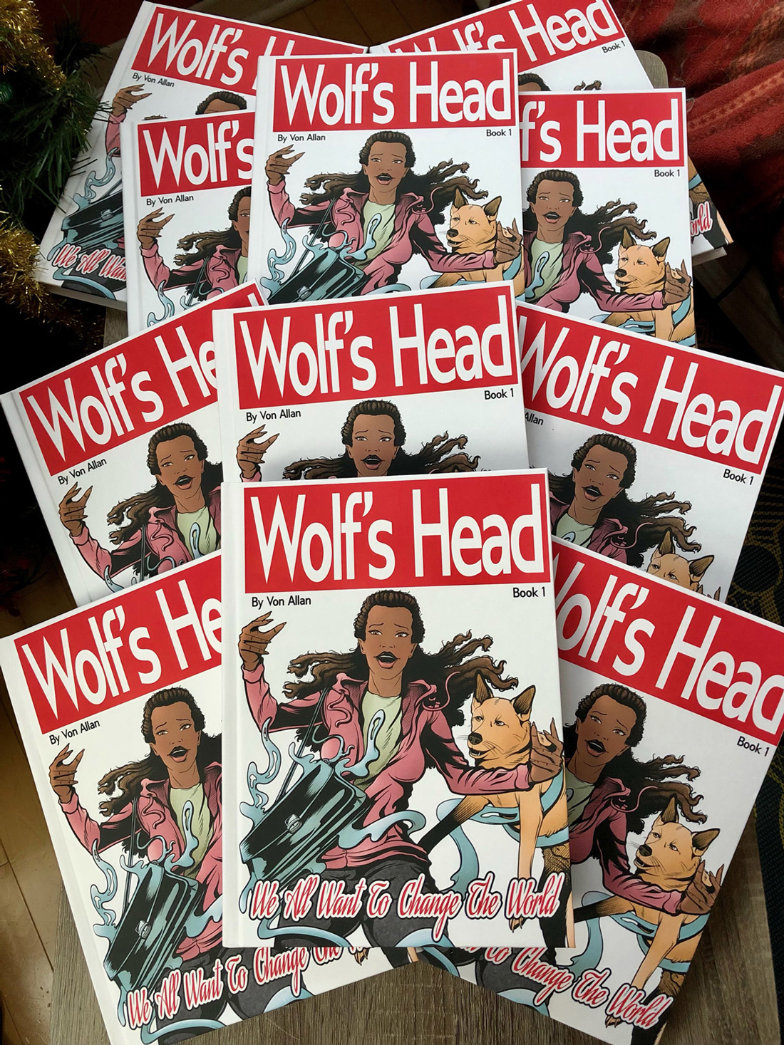
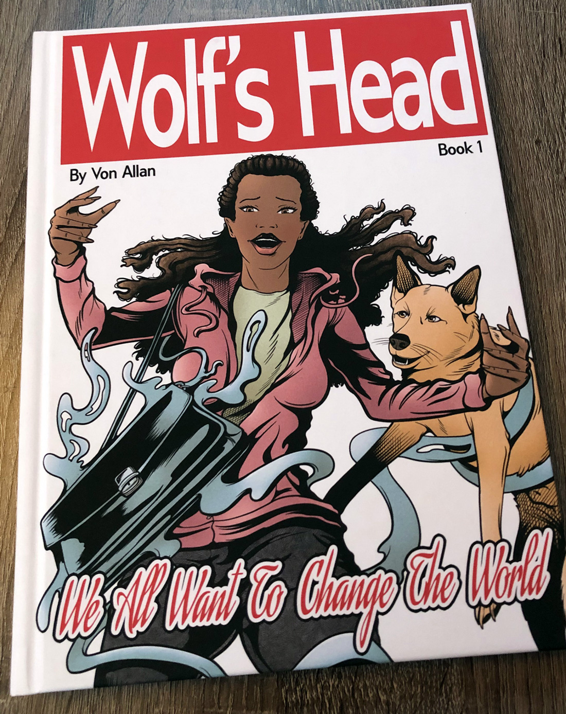
In the case of ongoing comic book series WOLF’S HEAD, my main mistake was in misunderstanding a key point about colour and colour theory. Since I didn’t realize I had made a mistake, it ramified; the same mistake wound up being repeated throughout the first fourteen issues (!) of the periodical version of WOLF’S HEAD. Not a single issue or two, but throughout all of those issues.  


Yeah. Can you imagine my frustration? 


So what exactly was the nature of my mistake? Well, it’s tricky to explain, but I’ll give it my best shot. Throughout the first fourteen issues of WOLF’S HEAD, I had used a “cell-shaded” approach to colouring. The idea was to use simple shadows to add nuance to the colouring process. “Simple” being the operative word. I wanted WOLF’S HEAD to have fairly simple colouring. Why? Well, I love black and white inks. I really do, and I busted my ass to become a strong enough inker that my work would look nice and crisp in pure black and white. I prefer colours to support the inking and not “fight it.” I don’t want colours that fight — maybe a better word might be “obstruct” — my inks. To do that and do it effectively meant that I had to do quite a bit of research to fully understand colour as it applies to comics. And I had to build a palette that would work within that key restriction. 


Now, to continue to explain this requires a quick side-step into printing technology. I’ll keep this as simple as I can, especially because chatting about printing technology tends to make an audience’s eyes glaze over. And I’m no exception to that! So, as quickly as I can, here goes: full-colour printing typically uses what are called CMYK inks, used in some colour printing. That’s Cyan (“C”), Magenta (“M”), Yellow (“Y”), and Black (“K”). Theoretically, each of those four colours can have a maximum concentration of 100%.

Example of CMYK Colour by Von Allan

Take Cyan, for example. You can have a very “soft” colour made with only 10% Cyan. You can also have a very “strong” colour made with 100% Cyan. The same is true for all four of the colours that make up the CMYK colour model. All four of these colours (the “CMYK”) can be mixed together, up to a maximum of 100% each. That obviously means that the maximum amount of ink that could be used through this mixing process is, you guessed it, 400% (the maximum of 100% for each of the “CMYK” colours equals 400%).

Here’s the key caveat: while that is true within certain printing applications and even digitally (inside a graphics program like Adobe Photoshop), in reality it very much depends on what colours and in what percentages the actual physical printer is capable of printing. In my case, I was restricted to a total ink mix of 240%. Not 400%. 240%. I can use any colour percentages I want, just as long as the total colour combination does not exceed 240%.


As a result, this means I can’t have a colour mix of, for example, 75% C + 75% M + 100% Y. Why? Because the total ink required to use that colour mix adds up to 250%. And 250% is 10% over my maximum restriction of 240%.


Well, what happens if I use more than 240%? Simple. The printer will have to adjust any colour found to be over 240%, bringing that colour mix back to being within 240%. Colours out of the printable range are called “out of gamut” colours. The trick with these “out of gamut” colours is that I can’t control the transition back to within 240%. It’s often made automatically by software used by the printer. In the rare cases it’s not, then often the print-ready file (the file that the printer will actually use to print the book) will be rejected. Either way, “out of gamut” colours are to be avoided.


As a result, I had to build my colour palette with that 240% restriction in mind. And honestly, it’s not too much of a restriction. I’ve always preferred using so-called “restricted” colour palettes, mainly because I don’t need an endless amount of colour. I really don’t. I just need to have enough variety of colour to enhance my storytelling. At the end of the day, that’s my goal: stronger storytelling. Colouring is simply one of the “tools in the toolbox” that allows me to do just that. Building a palette from scratch allows me to keep my ink limit of 240% and avoid any and all “out of gamut” colours.

So, with all of that said, what was the problem? Well, the clue is in the colour mix. Remember that 240% limit? My black lineart (the actual black and white inked art) is built out of what are known as “Rich Blacks.” All that means is that rather than build the black lineart out of exclusively 100% K (so-called “Flat Black”), the black lineart is actually built out of a mix of colours. While there is no hard and fast rule (well, save for that 240% maximum), I happen to use the following colour combination: 60% “C”, 40% “M”, 40% “Y”, and 100% Black “K.”

That colour mix creates a very nice “Rich Black” that is really quite lovely.

Example of 100% Flat Black Colour by Von Allan

Example of 240% Rich Black Colour by Von Allan

Ready for my mistake? Recall that I said I used “cell-shading” to build up simple shades and shadows on both characters and backgrounds. Well, some of those shades came very close to that “Rich Black.” I might use a shadow of 90% “C,” 73% “M,” and 73% “Y.” That gives a final ink mix of 236%, only 4% off from my 240% total ink limit and thus my 240% “Rich Black.”


Uh-oh.


Why “uh-oh?” By bringing some shades and shadows that close to the value of my actual lineart, these shades and shadows risked obscuring my lineart. As a result, in scenes that used these very dark colours (also known as “low key” colours), they caused my lineart to almost disappear. That crisp lineart that I wanted wouldn’t look so crisp. In fact, it tended to almost “blend” with the colour.


Oh no!

Inking and colour mix by Von Allan

Worse, I didn’t realize it right away. I never even thought about it. Eventually, I had begun to realize the problem around issue 11 of the periodical series, but I couldn’t quite frame the problem in my head. I was unsatisfied with how my colours looked, but I couldn’t explain why. I also wasn’t sure what to do about it. I was nervous about making a significant colour change while the series was ongoing, so I played for time — continuing to create and distribute new issues of WOLF’S HEAD — while I researched what had happened and tried to figure out exactly how to fix it.


The answer wasn’t easy to come by and I actually came across it by accident. In fact, it was two different experiences that led to the eventual solution.


The first was while I was doing some research on bande dessinée, that wonderful phrase for French-language comics. Specifically, I was reading Ann Miller’s READING BANDE DESSINÉE, where she makes the following point:


“By now, the crude drawing style of the early albums had given way to the elegance of the ligne claire, or ‘clear line’, the graphic style which eschews shading, gradation of colours, and hatching in favour of clear outlines, flat colours, and geometrical precision. It also implies narrative legibility. Hergé defines it as follows: ‘You try to eliminate everything that is graphically incidental, to stylize as much as possible […] in fact, the ligne claire isn’t just a matter of drawing, it also refers to the script and the narrative technique’ (Peeters 1990: 204). Bruno Lecigne has argued that the ideological efficacy of the ligne claire lies not in what is chosen for depiction, but in the idea that the world is legible (Lecigne 1983: 40).” (Miller, Ann, READING BANDE DESSINÉE (Bristol: Intellect Books, 2007) 18).


You would be forgiven if you’re thinking that it was the lack of shading that stood out to me. It wasn’t! Rather, it was the notion of ‘narrative legibility’ and the corresponding idea that the ‘world is legible’ that caught my imagination. Why did that excite me? Because it fit perfectly with what I’ve long been trying to do with my own writing! I strongly believe that readers shouldn’t have to “decode” or otherwise deconstruct the story in front of them. It’s not their job to decipher the “grammar” of comics. That’s my job and I need to do it in the clearest and most concise way possible. No reader left behind.


More could be written on this subject — quite a bit more — but, for now, I want to focus on how Miller’s words played through my mind. I wasn’t as swayed by the lack of hatching or the use of flat colour and whatnot, mainly because I have seen examples of ligne claire that doesn’t do this. As one small example, the cover of the English edition of Hergé’s DESTINATION MOON immediately comes to mine.

In fact, the notion that the philosophy of ligne claire doesn’t only apply to lineart was also a shock to me. What I realized is that ligne claire preserves the integrity of the lineart by ensuring that strong colour (i.e.: low key colour) is never so strong to challenge the lineart. To bring it back to the language of colour percentages, it simply meant that none of my “darkest” colours could ever have an ink mix that was too close to 240%! That 236% I mentioned a few paragraphs ago? That was right out, as was any other colour that came too close to 240%. Even 210% might be a problem.


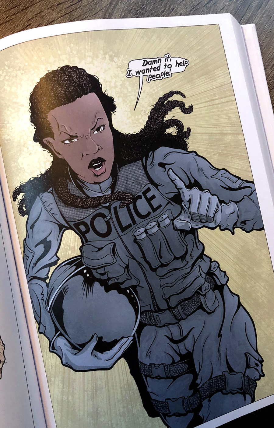
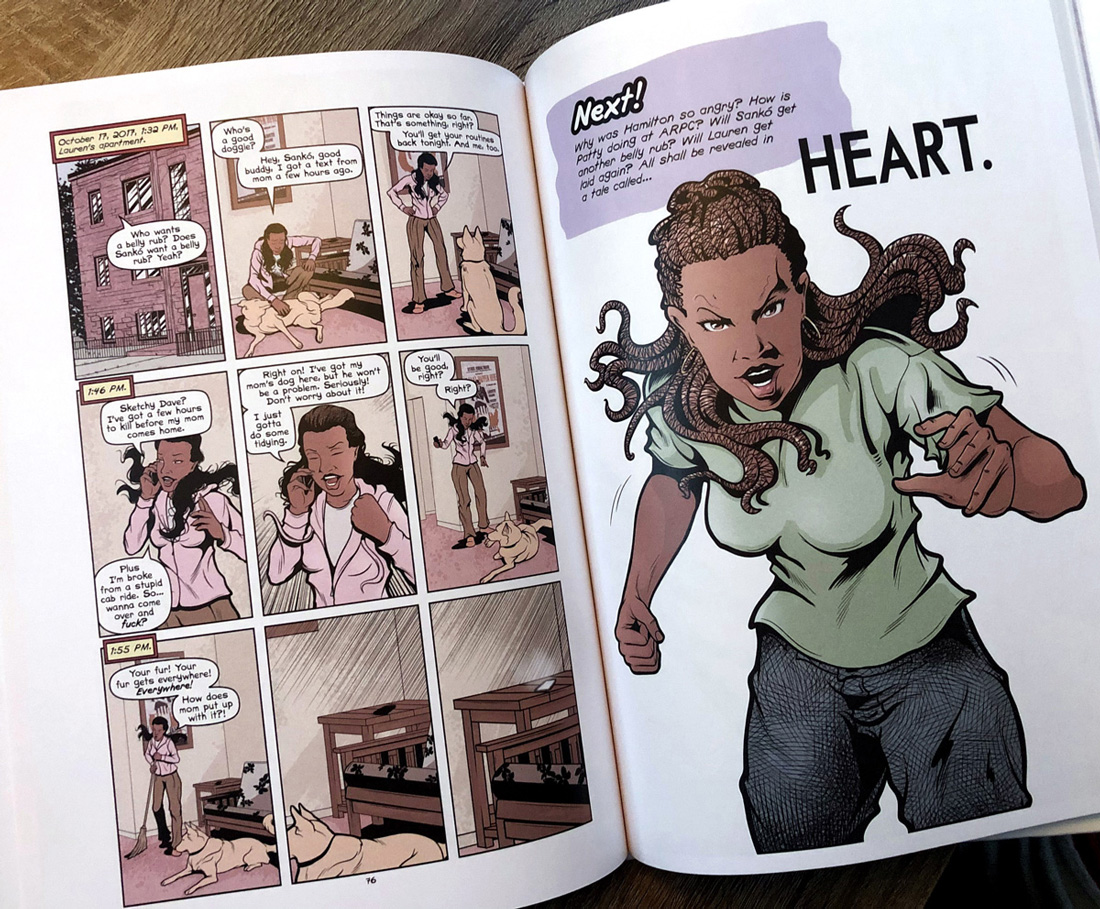
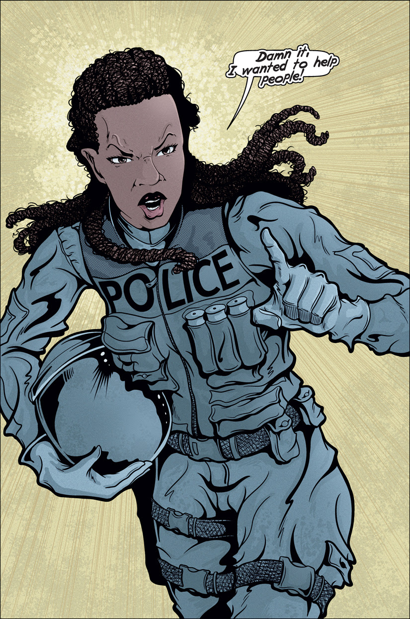
I quickly came to realize that this posed a significant challenge. Why? Well, the main protagonist of WOLF’S HEAD is Lauren Greene, along with various supporting characters (like her mom Patty). Since both Lauren and Patty are black, the colour combination I typically used for their skin tones was fairly strong. Lauren, for example, is based on a default mix of 31% “C,” 60% “M,” and 60% “Y.” While that’s only a total of 151%, well-within my 240% ink limit, that was also unshaded. When I added shades or shadows to Lauren’s skin tones, that typically was a mix of 55% “C,” 85% “M,” and 85% “Y.” That’s a total of 225% and thus very close to my 240% maximum. In other words, those shades and shadows were far too close to my “Rich Blacks” lineart. Far too close. 


When I reviewed the original print collections of WOLF’S HEAD, I could see the problem — now that I was finally aware of it!


What to do?


Thinking on the problem and trying to brainstorm solutions eventually led me to the second part of the solution. As with most artists, I look at the printed works of others, mainly to keep myself apprised of what’s going on — broadly — with the medium. I found a reference to an American comic book series that I had missed when it was first serialized. This was the comic titled CONVERGENCE, published by DC Comics in 2015. In particular, I was looking at one of the spin-off titles, specifically CONVERGENCE: SHAZAM, with art by Evan “Doc” Shaner and colours by Jordie Bellaire. It was Bellaire’s colours, over the wonderfully “open” lineart by Shaner, that really stopped me. Bellaire’s colours were beautiful; and better, from my point of view, they were missing much of the “special effects” that I find tends to so often overwhelm the lineart in corporate comics. Also absent, however, was the cell-shaded approach to shades and shadows that I had been using in my own work. In addition, Bellaire used a beautiful “texture” effect to add a bit more nuance to her colours.


In fact, this latter point (the “texture”) led me to another thought that I wasn’t expecting. So many reprint collections of comics — those from the Golden Age right up to the beginning of the so-called “Modern Age” — tended to print the new collections on better quality paper. Gone were the old newsprint days! For those who wanted their collections on higher quality and/or archival paper, these reprints were just what the doctor ordered.


However… 


These reprints were often also recoloured, sometimes using the original colourists as a base-line and sometimes creating brand new colours, to facilitate reprinting these old titles for the new digital colouring age. Newsprint, despite its restrictions, gave older printed titles a “grain” or a “texture” that worked with the colour printing technology of the time. Taken together, the colours and the newsprint would often, I’d argue, create a synthesis that was stronger than the sum of its parts. With the modern recoloured reprints, often on glossy paper, that “grain” or “texture” was eliminated. The glossy paper simply doesn’t have it. The resulting reprint colours, even when they are close to the originals, lacked a certain something. It’s hard to put into words exactly what that absence is, but part of it was reprinted colour combined with glossy paper was too bright and often too garish.


It turns out that stripping out one part of the technology from that era (in this case, the newsprint paper) wound up hurting the colours. At least that’s my conclusion and argument.


When I saw Bellaire’s colours on CONVERGENCE: SHAZAM, I realized that she had resolved this “grain” or “texture” problem. Her colours, both on screen and in the printed comics, were nuanced and beautiful. And they didn’t suffer for being printed on relatively glossy paper, because the very texture she used “insulated” her colours from the excessive effect of the glossy paper.

Colour and Colour Texture Comparison by Von Allan

I also realized that Bellaire had — probably intentionally — resolved my cell-shaded issues. How so? Bellaire basically didn’t worry about them as she coloured over Shaner’s lineart. It sounds a little silly, I think, but I realized that I didn’t have to worry about them, either. That realization was a lifeline, because it meant that I now had a new method of approaching my own colouring. I could stop worrying about cell-shading at all. I could emphasize texture as well as colour and work within the ligne claire philosophy of colour to ensure that my lineart remained as clear and clean as possible, even if I continued to use hatching and other inking effects then many “pure” ligne claire practitioners prefer not to use.


With these new “tools,” I set about to test them with my own artwork and style. It was a relatively slow process, partially because I was still working on new issues of WOLF’S HEAD throughout this period, but also because the only way to test it was to recolour actual artwork that I’ve done to see the result. Well, it was slightly trickier than that because I also had to see how a printer would actually handle this new colouring process. I went back to some older short stories that I had written and illustrated back in 2015 and 2016 and recoloured them with this new approach. Once they were complete, I was able to publish the stories in a new publication titled STORIES! 2015 TO 2019, a short 36-page collection that clearly showed that the new process worked. And worked very well.


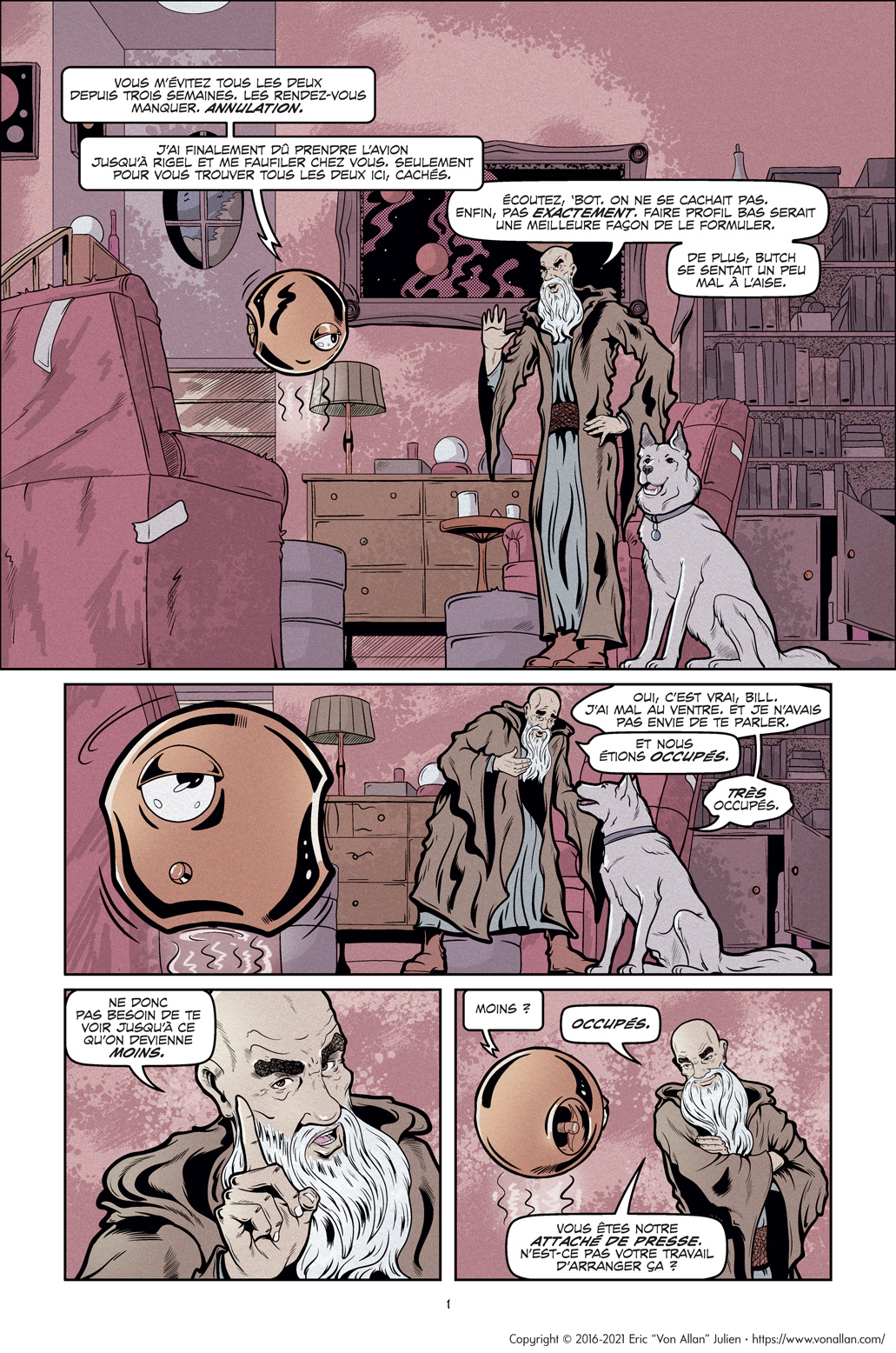
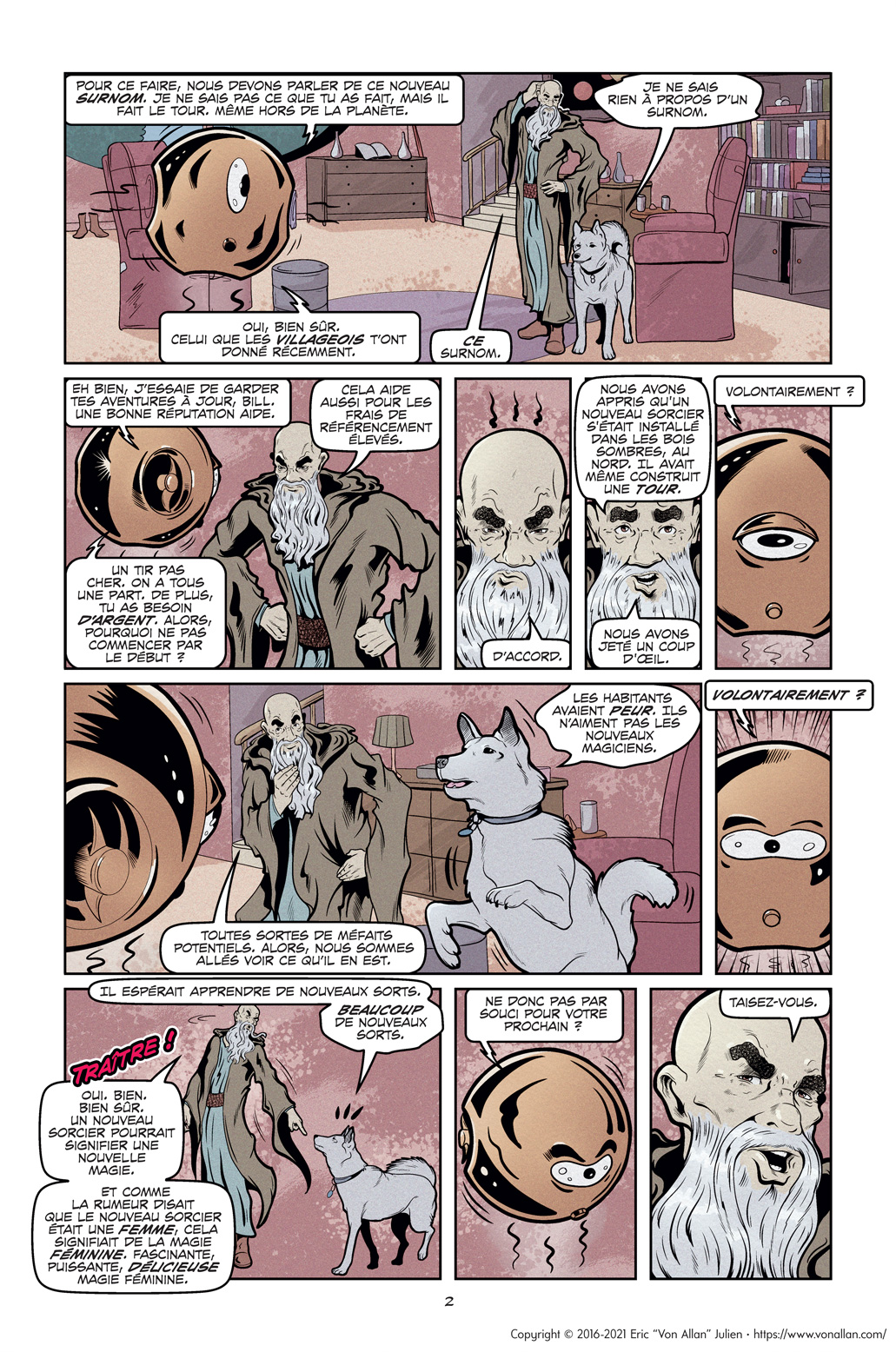
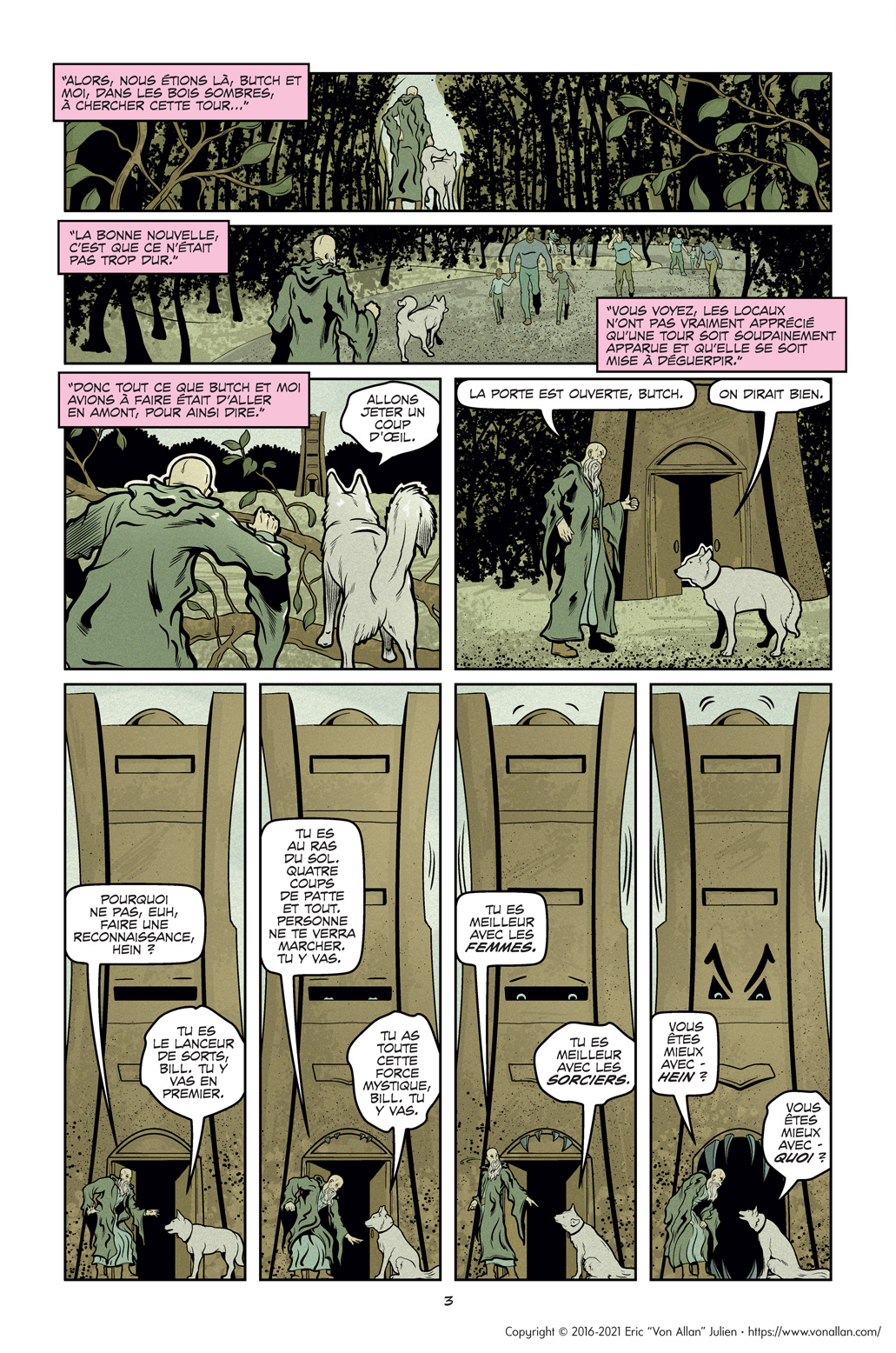
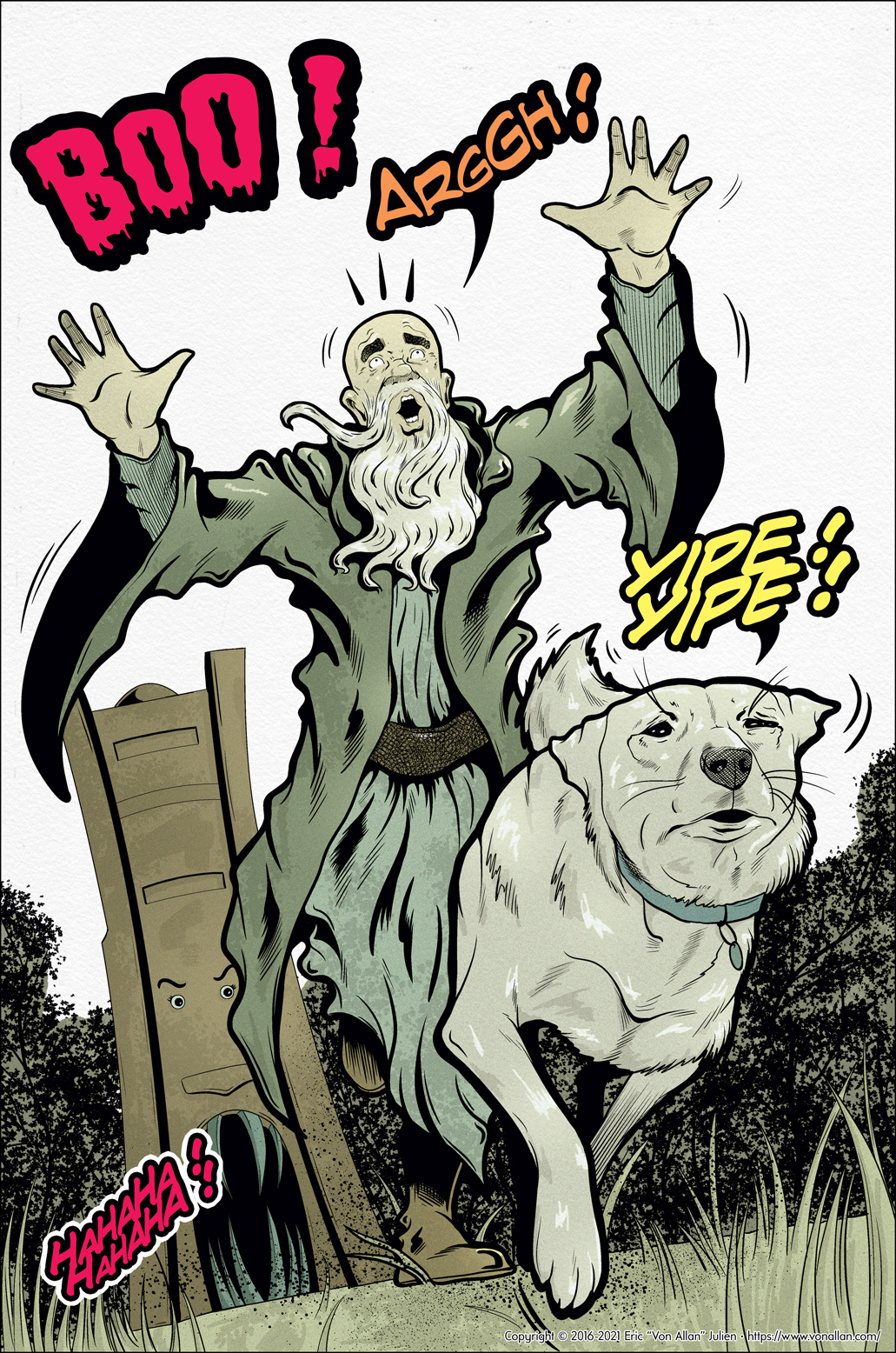
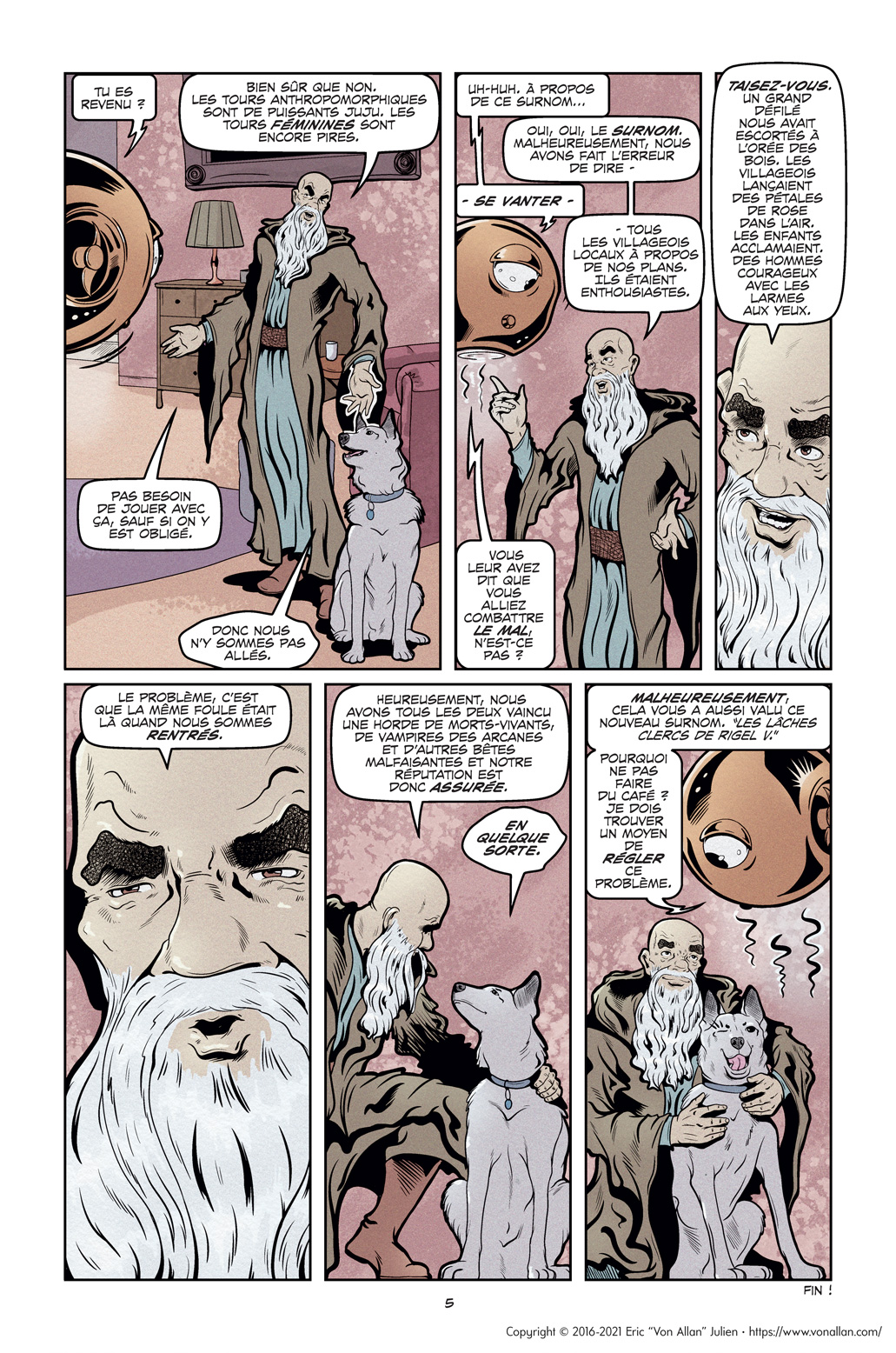
The next step was to recolour some short stories that I was quite fond of, but that were coloured using my now “old” cell-shaded style. These stories starred two cantankerous wizards — a human and a dog — and their adventures were originally published in the print collection WIZARDS FOR HIRE — CHEAP! I was hesitant to do recolour them, but I know I needed to see what would happen. Test, test, and again test!

Colour comparison featuring Bill from The Cowardly Clerics of Rigel V by Von Allan

I was thrilled with the result! I don’t think any of these stories have ever looked better. Dropping the cell-shaded look was the key component of that, allowing my lineart to shine in a way that I had never experienced before. And there was nothing lost with this new colouring approach, either. I had worried that I was overlooking something; that the cell-shaded approach gave my art a certain “something” that I might not be aware of; losing it might damage my stories in ways that I might not be aware of. That proved to not be the case and was an immense relief. Further, adding the “texture” gave my colours a certain je ne sais quoi that they didn’t have before but still worked extremely well with my lineart, my inking.


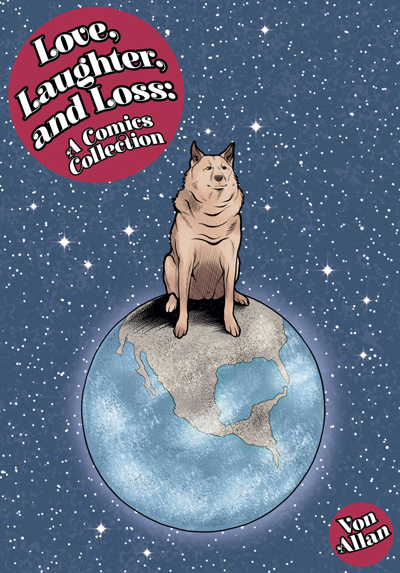
In fact, these recolouring experiments has led to an upcoming collected edition containing all of these short stories in a new hardcover edition titled LOVE, LAUGHTER, AND LOSS: A COMICS COLLECTION.


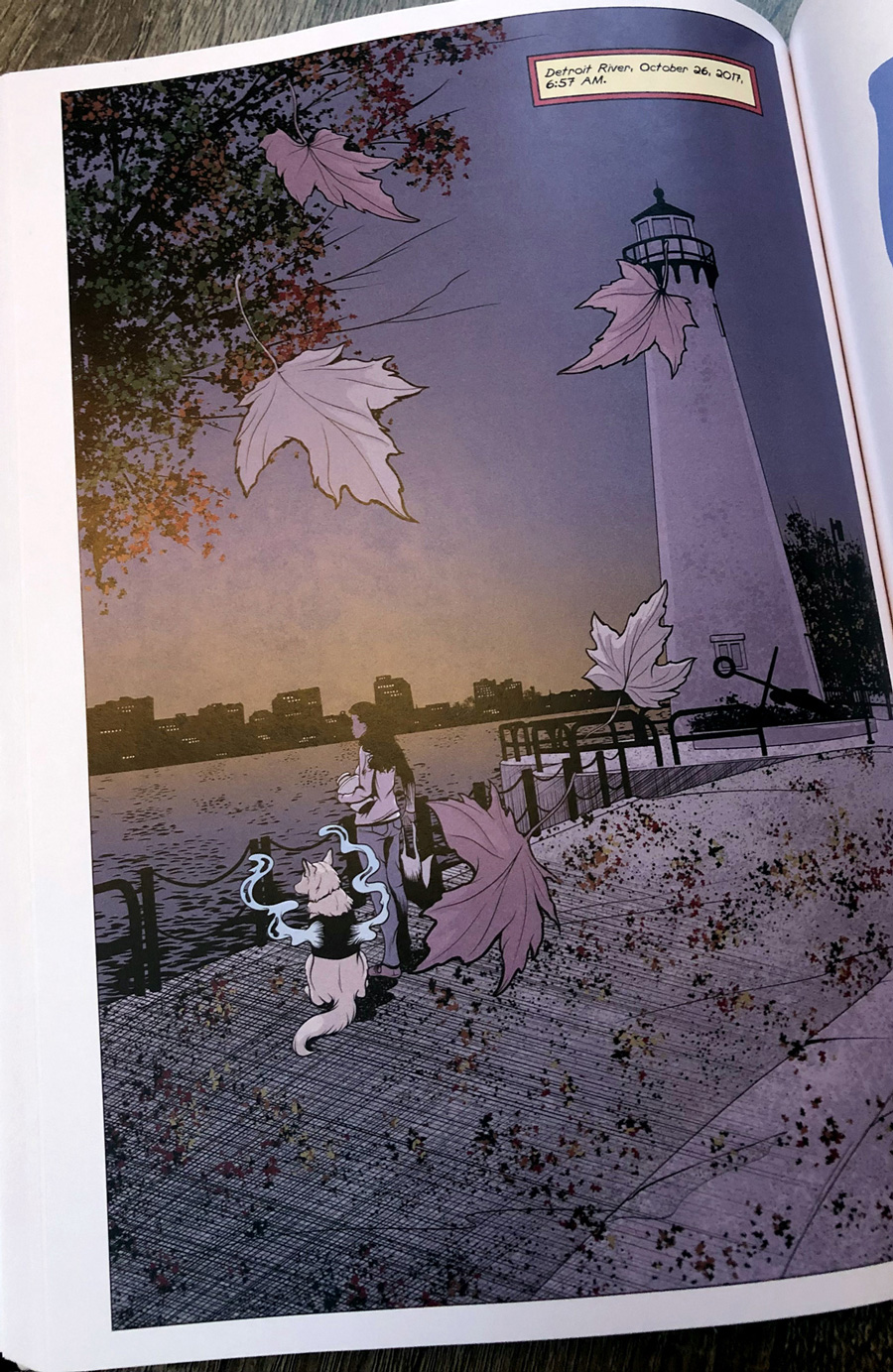
With these experiments and tests successfully resolved, I set about the big challenge: recolouring all fourteen issues of WOLF’S HEAD to reflect this new colouring approach. It was a great deal of work, but as I did the work, I became happier and happier. Lineart that was previously “hidden” by my cell-shaded colours suddenly was clear and crisp, exactly as I had intended it. The “texture” didn’t obfuscate or conflict with either my lineart or my colours. And the simplified colours, inspired by ligne claire, were beautiful in their own right. In fact, most of my underlying colour remained exactly the same. The difference was primarily oriented around that pesky cell-shaded approach. Eliminating that made my colours sing. And, together with my lineart, the colours were stronger than they ever were before.


Was it easy? Nope, though probably not as hard as I expected. Did I learn as I went? You bet! Do I regret not hitting on this methodology earlier? Yeah. Yeah, I do, but as the old saying goes, “we learn by doing.” The only way I could truly know what the result would be was to test. While that testing process was slower than I might otherwise like, it was well-worth the time it took.


Here, of course, is probably the key question: am I happy with the result? Oh, absolutely I am. I really am. 


One of the most amazing things about art — here I use the word broadly, meaning both writing and visual art — is that the learning never stops. It’s part of what makes art so exciting. And yup, it’s also what makes it pretty frustrating from time to time. It’s always a battle: learning, growing, failing, and learning and growing again. There are false starts, blind alleys, and mistakes; that’s part and parcel of the entire process. We learn by doing, by trying, by failing. The challenge is to never quit. To never stop learning and to never stop growing. To be part of the world and to be open to it. Sometimes we grow by learning, sometimes we grow by failing


I’ve made a lot of mistakes; the point is to not let mistakes define me. That’s sometimes a challenge — sometimes a big challenge — but it’s also part of the fun.  


And never forget: making art, regardless of one’s skill level and experience, is a great deal of fun.

Colour comparison featuring Patty from Wolf's Head by Von Allan

Making A Splash: Von Allan's Wolf's Head


One of my favourite old-school blogs is Diversions of the Groovy Kind, run by "The Groovy Agent" himself Lloyd Smith. And one of the funner things that Smith does are the "Making A Splash" series of comic book posts. For the uninitiated, these are splash pages of comics, typically by the same artist or from different artists working on the same title. Seriously, go check those out! They are awesome!

Since I now have 14 (!) opening splash pages from my ongoing comic WOLF'S HEAD, I thought it would be a great deal of fun to post my own "Making A Splash" series. Here goes!


Quick April 2021 Update: I've recently rethought my approach to colour, especially regarding how it applies to comics. As a result, new editions of WOLF'S HEAD will reflect this new approach. The pages below have been updated to reflect this, but please note that the legacy versions (both in print and digital) will contain my older "cel-shaded" approach to colour. New hardcover (!) versions of WOLF'S HEAD are planned in the not-too-distant future and these will contain the new colours. Caveat emptor and all that.

Wolf's Head Issue 1 Page 1 Written and Illustrated by Von Allan

Wolf's Head Issue 2 Page 1 Written and Illustrated by Von Allan

Wolf's Head Issue 3 Page 1 Written and Illustrated by Von Allan

Wolf's Head Issue 4 Page 1 Written and Illustrated by Von Allan

Wolf's Head Issue 5 Page 1 Written and Illustrated by Von Allan

Wolf's Head Issue 6 Page 1 Written and Illustrated by Von Allan

Wolf's Head Issue 7 Page 1 Written and Illustrated by Von Allan

Wolf's Head Issue 8 Page 1 Written and Illustrated by Von Allan

Wolf's Head Issue 9 Page 1 Written and Illustrated by Von Allan

Wolf's Head Issue 10 Page 1 Written and Illustrated by Von Allan

Wolf's Head Issue 11 Page 1 Written and Illustrated by Von Allan

Wolf's Head Issue 12 Page 1 Written and Illustrated by Von Allan

Wolf's Head Issue 13 Page 1 Written and Illustrated by Von Allan

Wolf's Head Issue 14 Page 1 Written and Illustrated by Von Allan

Wolf's Head Issue 15 Page 1 Written and Illustrated by Von Allan

Other Links

Wolf's Head by Von Allan

Link to Von Allan's Wolf's Head comic book series

Contact Von Allan

Name

Email *

Message *

City of Ottawa Grant Support

Von Allan Studio gratefully acknowledges the financial support of the City of Ottawa.

City of Ottawa logo

Creative Commons License

CBC Trailblazer Profile

Documentary Film Excerpt

I Am Still Your Child Trailer